Celestino
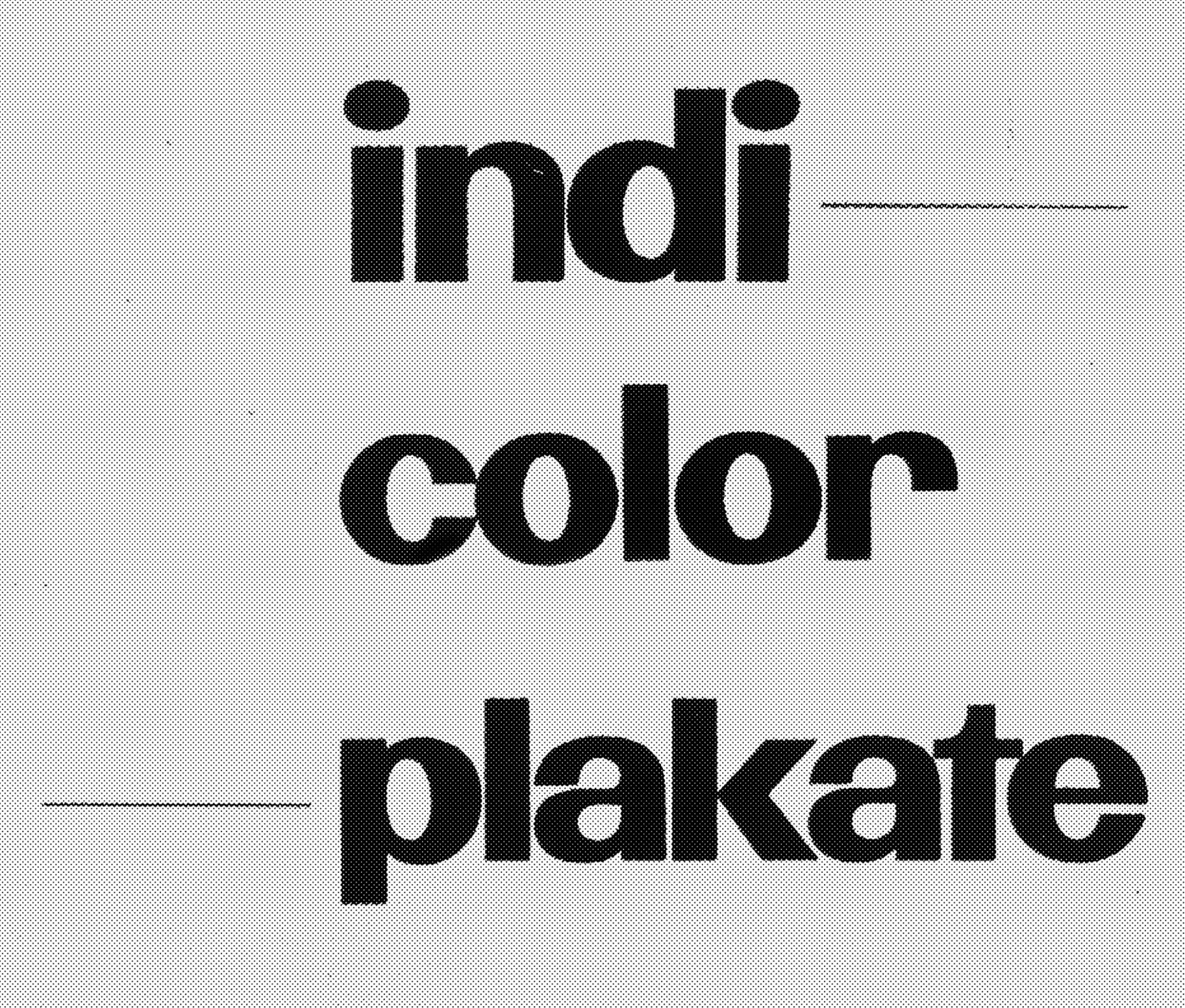
Celestino started from studying Celestino Piatti’s work and posters. A very original and singular source was observed and went through the process of designing the typeface corresponding to its shapes. It has round and generous curves that fit in a sans serif style typeface. Celestino was developed for book legibility at small sizes. It will definitely be efficient for poster uses and wide formats. It borrows from the graphic style of the painter, with very singular oddities and proportions.
Meyers
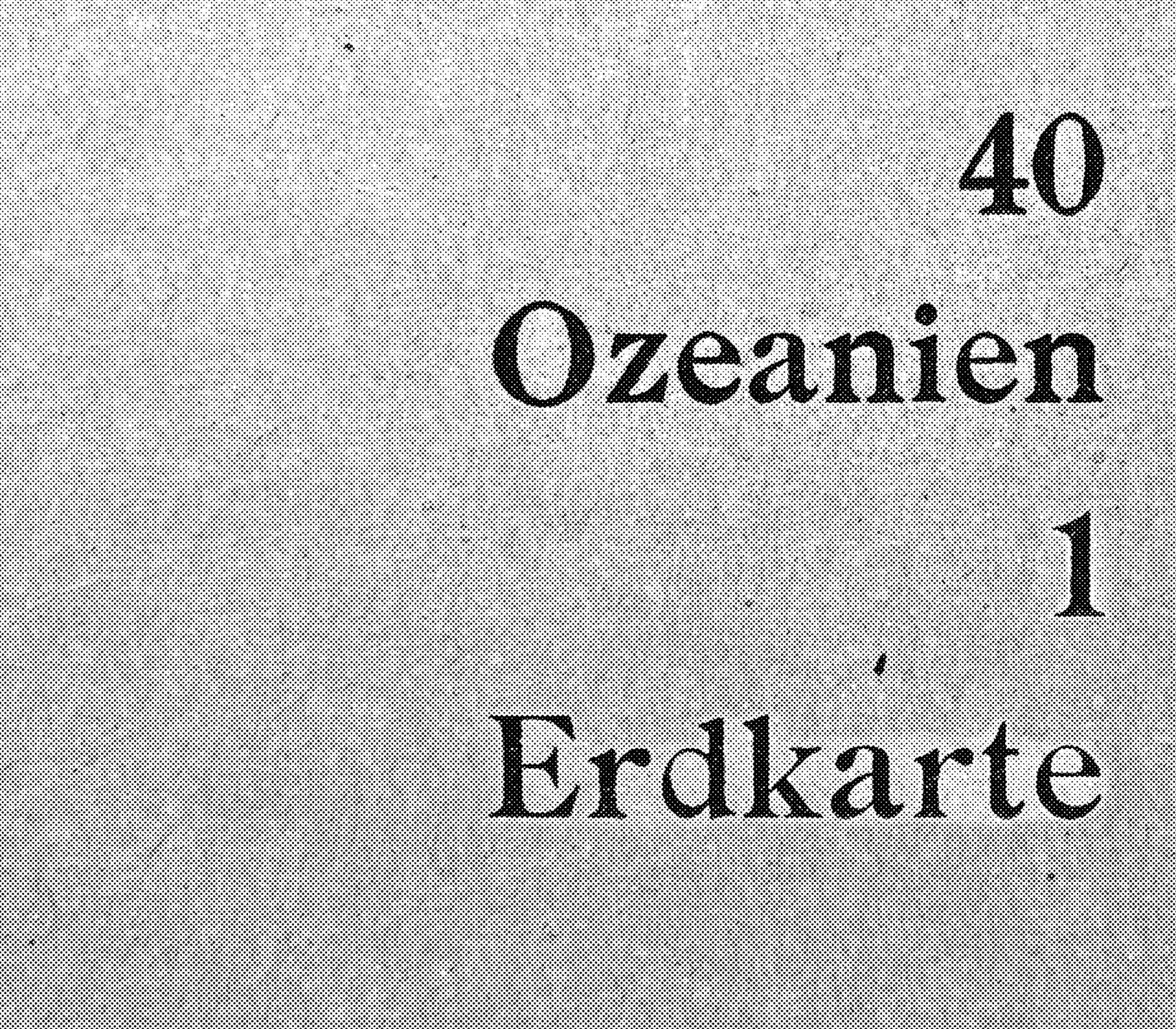
Introducing Meyers ! First spotted in a Germanic world atlas from 1921, the typographic character punctuated the book by indexing different geographies. The titlings showed a serif character with singularities and originalities. The shapes of the Meyers demonstrate all the qualities of a reading character with slightly marked particularities. Some plays of curves in round shapes have been harmonized, with a recurring play of fullness and downstrokes across the typography. Meyers delicately borrows certain aspects of already existing typographies to nicely demonstrate his own character. It will be effective both in body text and in titling typography.
Yasaburo
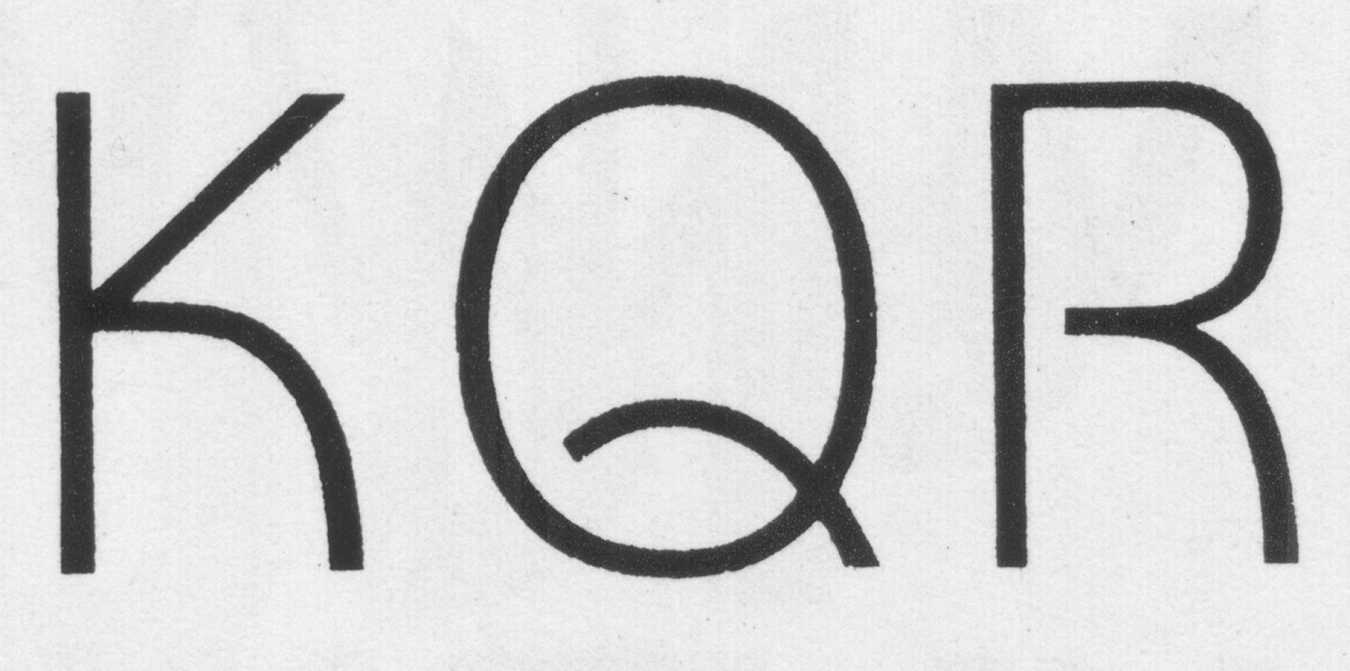
Yasaburo started observing Yasaburo Kuwayama typographic works. Digitizing began in 2019 and sooner became legible for text uses. Its drawing has generous flow and curves. A first version was drawn and developed in October 2023. It has the qualities of a sans serif typeface that will be readable a small sizes. Its flow will be appreciable for headlines and poster uses. A font family is in the making to develop more bold styles.
Accidenz
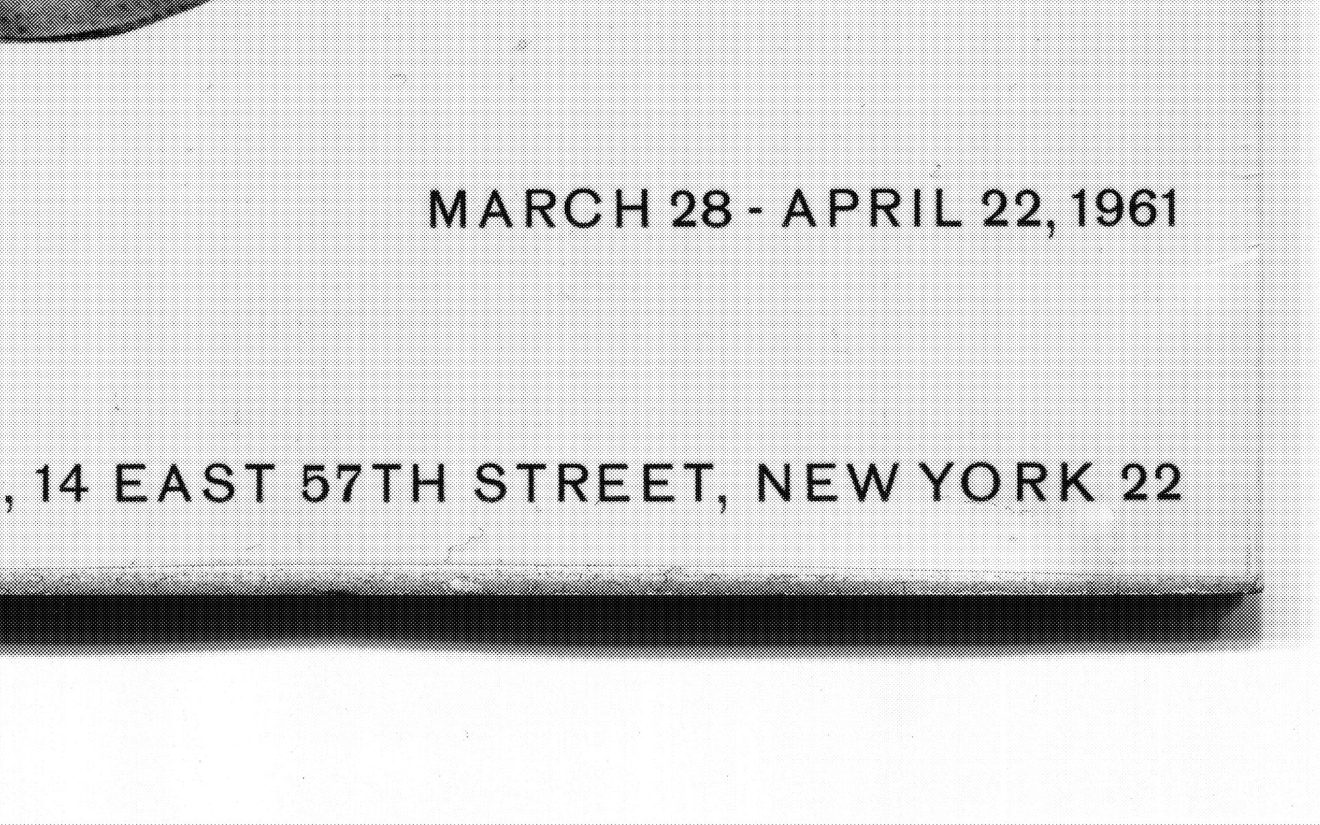
Accidenz is a proposal that focuses on previous versions of the digitized version of the Aksidenz Grostesk. This version tends to reinterpret the subtle nuances and delicate contrasts present in the small reading bodies of the famous typography. Accidenz would like to restore the character to its noble and distinguished aspect. It is a functional sans-serif typeface that will make itself readable even in the smallest reading sizes. Spacing and kerning with Igino Marini.
Wayne
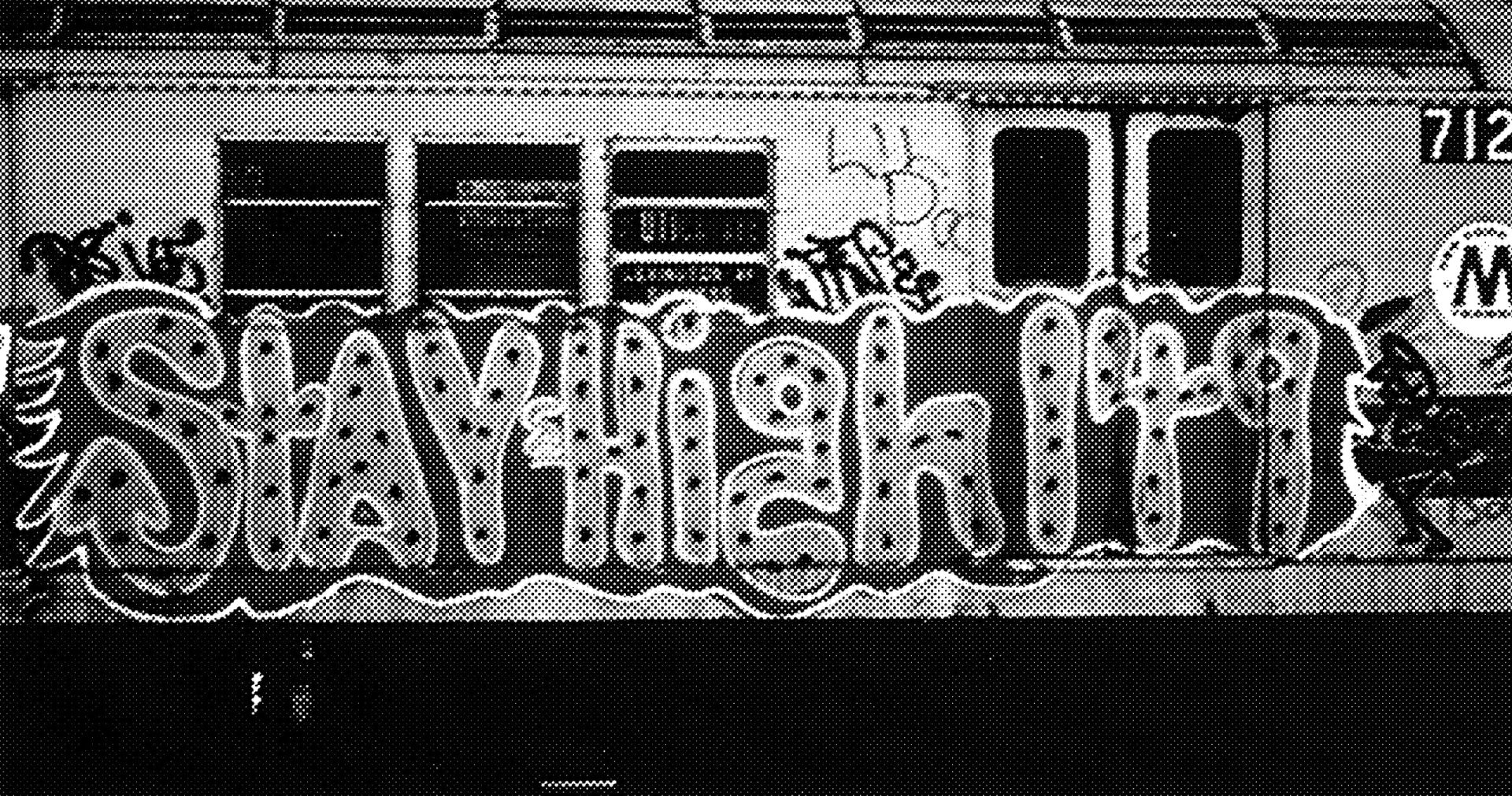
Wayne is a tribute to the work of Wayne ‘Stay High 149’ Roberts, a pioneer of the graffiti movement in New York. Several sources were observed and above all re-interpreted. I tried to typify some of my drawings, and this typical “Throw Up” style into a functional alphabet. Wayne is a typography largely inspired by the “flop” style of lettering with round lines, characteristic and widespread in multiple forms of graffiti. It is a character with rounded endings, rather considered for headlines and display use.
Bangla
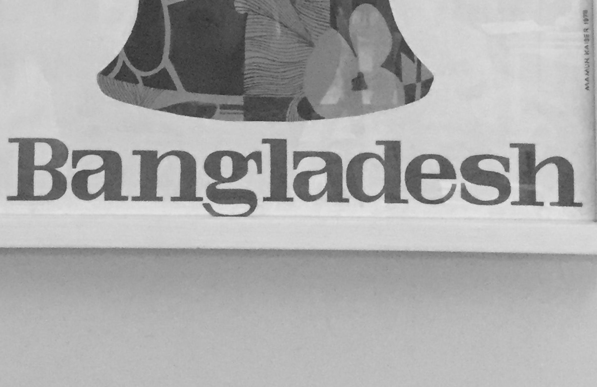
Introducing a new specimen to our catalog. Bangla started from a singular poster spotted by Nina Paim in Bangladesh. A first draft of letters was imagined in 2019 and is now developped as a variable family. It has a bold and engaged character, with originalities in its drawing. We are currently pushing its limits to make it legible for small reading bodies. Development with Céline Puls.
Basel School Family Hairline
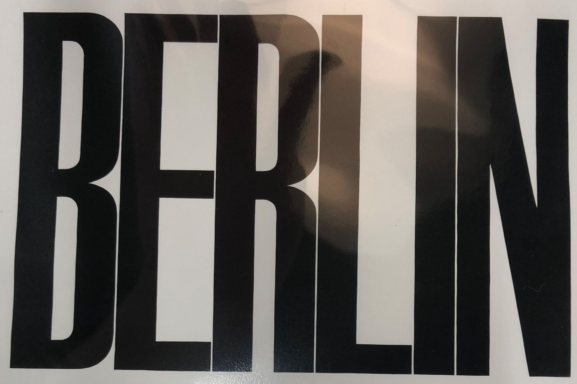
Hi there! Sources were observed with Fabian Harb at Schule Für Gestaltung in Basel. Emil Ruder type posters compositions, letter forms went into the process of designing the typeface. Three different weights were originally observed; each style is ready with the corresponding italics. Drawing with Ian Griffin, Brooklyn NY; the variable font is in progress. This one is a bold, efficient for wide formats and big scale compositions.
Basel School Family Bold
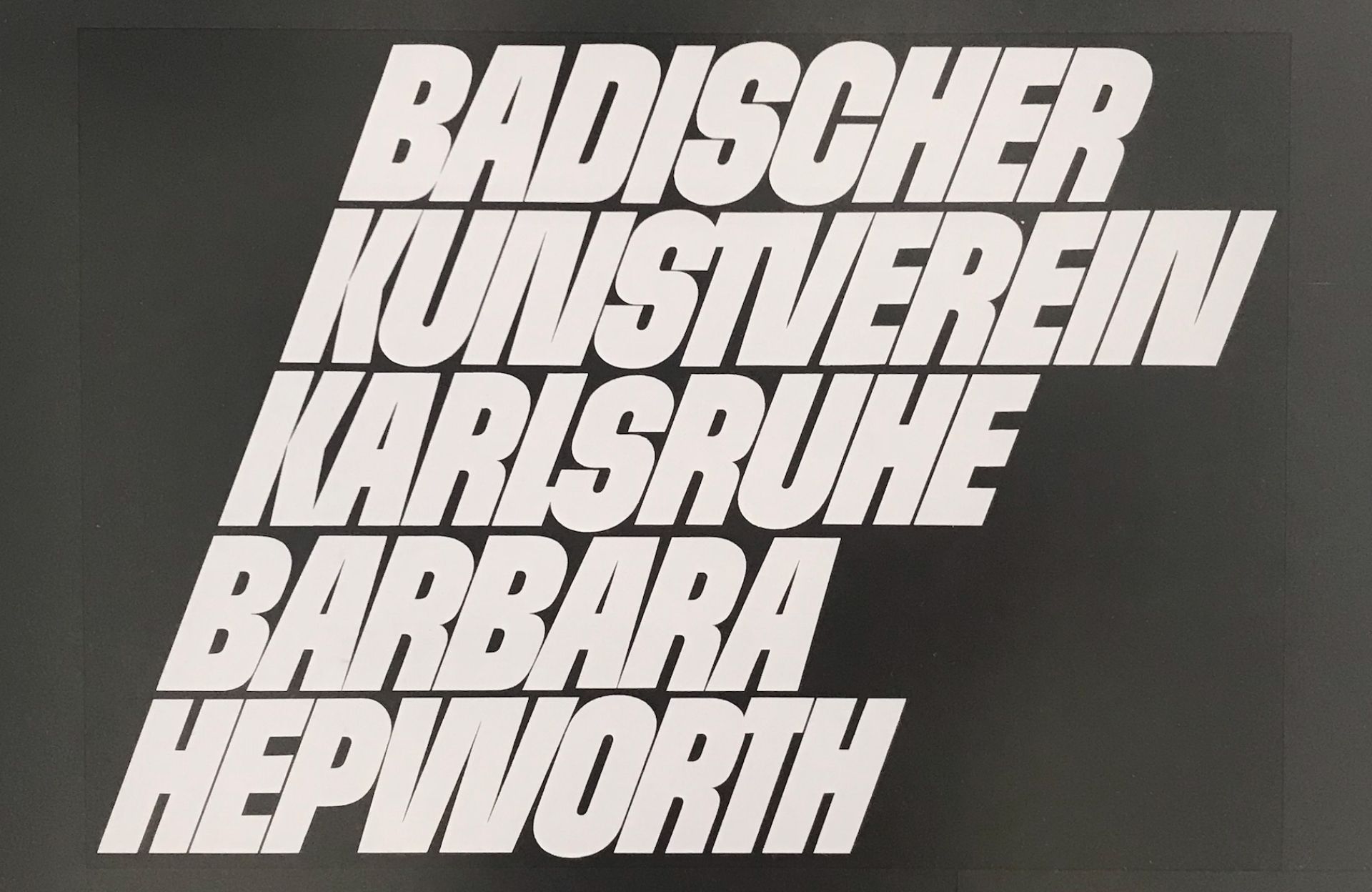
Hi there! Sources were observed with Fabian Harb at Schule Für Gestaltung in Basel. Emil Ruder type posters compositions, letter forms went into the process of designing the typeface. Three different weights were originally observed; each style is ready with the corresponding italics. Drawing with Ian Griffin, Brooklyn NY; the variable font is in progress. This one is a bold, efficient for wide formats and big scale compositions.
Basel School Family

Hi there! Sources were observed with Fabian Harb at Schule Für Gestaltung in Basel. Emil Ruder type posters compositions, letter forms went into the process of designing the typeface. Three different weights were originally observed; each style is ready with the corresponding italics. Drawing with Ian Griffin, Brooklyn NY; the variable font is in progress. This one is a bold, efficient for wide formats and big scale compositions.
Giles

Giles originally was found on a music record cover. Drawing started from a very small batch of letters and then new sources were observed from different perspectives. Definitely envisaged for wide spaces and large sizes. It is a straight forward character, showing subtle curves and roundings while being very black. It will make itself legible in large scales and for big formats.
Skool
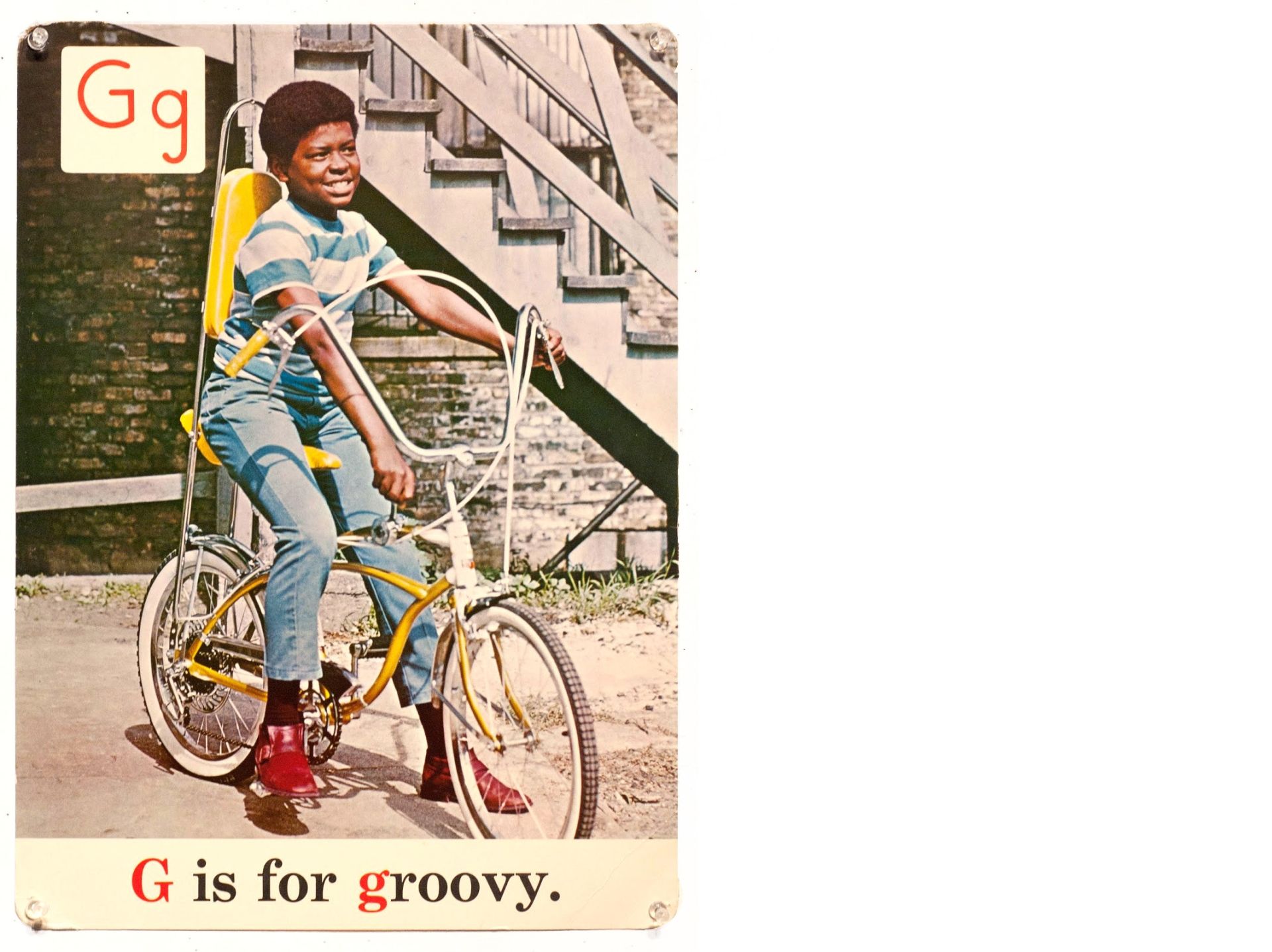
Introducing Skool, a typeface with singular character with tall
proportions and round drawings. A first light version was developed for
both headlines and alternative text. Skool distinguishes itself within
its elegant structure and delicate details.
Source originates from a set of cards originally published in Chicago by
Society for Visual Education. It was created by two educators June Sark
Heinrich and Bernadette H. Triplett during the Black Power movement in
the 1970’s. Author and editor of programs for early childhood education
they teamed up to produce the Black ABC’s.
The collection of alphabet flash cards was developed by the Black
Panther Liberation schools. It was used both for display and as a
teaching tool. The typeface wants to incarnate its spirit.